How to Move Shoppers Toward Your Displays
Almost 35 years ago, at the start of our Retail Adventures together, we began taking photos of the giant characters we’d find outside of stores. Dinosaurs, Paul Bunyans, elephants – we’ve seen it all. Some of those big guys still exist and have become beloved. And pure camp. Today, they have morphed into attention-grabbers avant-garde retailers house center stage on their sales floors in an attempt to build foot traffic. It's cool, but how many times do you need to see a big, permanent display before it gets old?
Shoppers prefer stores that offer something new each time they visit. The merchandise may be the same but the displays change. We can’t lose sight that the purpose of visual merchandising is to attract shoppers; catch their eye and move them toward product. Good display techniques make that happen. Let’s take a look at some good examples:
Research shows that 85% of consumers buy based on color – that’s a sizable number of shoppers. No wonder retailers repeatedly turn to color to build eye-catching displays.
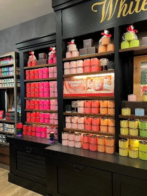
This candle display at Bath and Body Works is a perfect example of how to best use color. In this case, Color Ribboning is the technique used so the colors are set in vertical slices. (When the colors are set in horizontal rows the technique is called Color Blocking.) The vibrant colors attract attention, creating a focal point that draws shoppers to the display. The vertical line encourages shoppers to look up and down at the display, as well as forward.
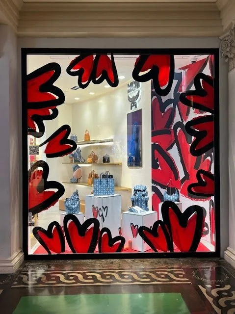
The bags and accessories inside this MCM store at Caesars Forumn Shops are colorful on their own, but you can’t miss this window. The bright red hearts function as a frame, drawing shoppers closer to the window, and ultimately into the store. The heart motif continues on the far right power wall, and on the pedestals used as speed bump fixtures. These hearts are vinyl but could easily be recreated in your windows with paint.
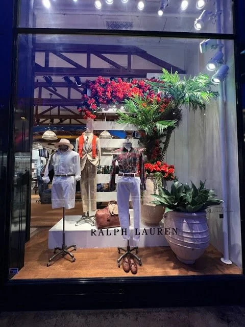
Ralph Lauren loves a pop of color, but this window puts other techniques to work as well. Note the platform to elevate the display and to keep it safe from unruly shoppers.
The three mannequins form a sight line that draws the eye up. Called the Pyramid Principle, this technique involves placing a tall item in the center of the display, flanking it with slightly shorter items on each side. Shoppers unconsciously seek the tallest item before scanning the smaller items and the rest of the display.
The number three is important because the human brain is wired to seek out the asymmetrical. That’s why we are drawn to displays that feature products grouped in odd numbers, especially in groups of three. These odd-numbered groupings force the eye to move around, causing the shopper to see more of the items on display.
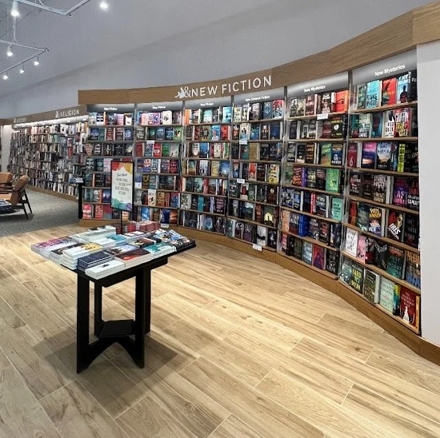
The semi-circle wall fixture in this newly remodeled Barnes & Noble Booksellers store features a display technique called a “hug.” Rounded shapes can make us think of community, friendship and protection. No wonder we are drawn to them. You may not be able to add a curve to your wall fixtures, but you can place round tables on your sales floor.
Barnes & Noble also uses a lot of simple speed bump tables like the one in this photo to feature books and gifts. Note the signs used on the table and on the wall. Signs are a powerful, yet underutilized, marketing tool that can directly influence purchase decisions. If more than 70% of those decisions happen on your sales floor then your displays should always be properly signed.
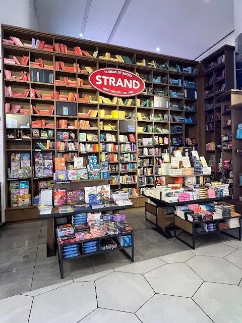
Here's an idea to steal from another bookseller. The Strand Bookstore at LaGuardia Airport uses tall shelving to attract attention. Actual books are only merchandised to a height most people can reach; the top shelves house books covered in colorful paper. This creates the illusion of a larger inventory and fills the empty space between the fixtures and the ceiling.
What’s happening on the top of your shelving units? Are samples placed randomly and sporadically? Is the space used to store excess inventory? Is it cluttered with stuff that has no other home on your sales floor? Be objective and think about the impression that makes on shoppers. And think about what you could do instead to make those areas a more cohesive part of your sales floor.
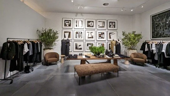
Banana Republic recently added art and home furnishings to its merchandise mix with a new division called BR Home. This store in New York’s SoHo neighborhood mixes home décor and ready to wear in the same location. The different room settings give shoppers ideas to recreate the look in their own spaces. The art in the center serves as a focal point, drawing the eye upward and encouraging shoppers to take in the entire room at a glance.
This concept serves as an example that you are not confined to only selling your core categories. Branch out by incorporating merchandise you do not currently carry that shoppers will enjoy and that makes sense for what you already stock. Higher end tote bags to carry art and craft supplies could be a good place to start.
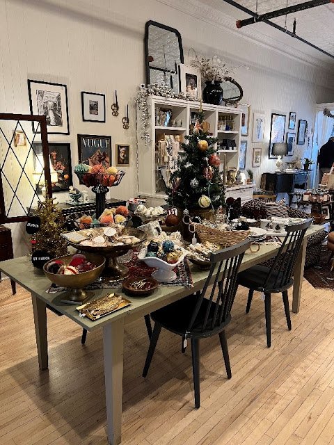
House of Charlemagne, in our corporate home of St. Charles, Illinois, is a store brimming with unusual finds. It’s an eclectic mix of new, vintage, and lovingly restored furniture. There are no rules for merchandising in this store, if it works good together then its good to go. You might find a reproduction of Vermeer’s Girl with a Pearl Earring blowing a big pink bubble hanging over an elegant (we bought it) repurposed buffet, or sweatshirts that read “St. Chuck” (bought those, too!) hanging beside gorgeous handbags. It’s fun and that’s the point.
Everything in this photo works because the displays in the House of Charlemagne tell carefully curated stories. And that’s important. It’s easy to take a shipment from a vendor and slot it into a space on the floor, but it makes more sense to cross merchandise that product with relatable items to increase your average sale. Your displays – especially merchandise housed on speed bumps – should be curated to entice shoppers to spend more time looking while encouraging them to buy more.
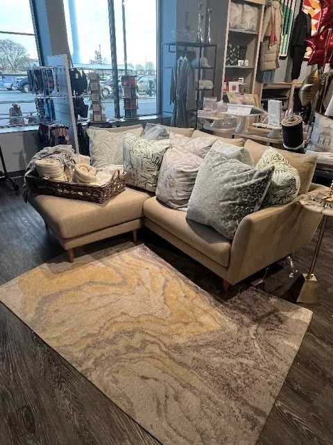
You would think that this is a nicely appointed furniture store but you would be wrong. It’s a grocery store and this display is about 25’ from the produce department.
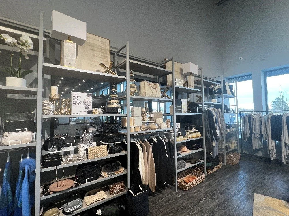
Sendik’s Food Market in Oconomowoc, Wisconsin isn’t your usual supermarket, and the merchandise mix and visual merchandising isn’t what you’d expect to find either. Sure, there are aisles and aisles of canned and packaged goods, but there is also a beautiful floral department, a giant machine that bakes bread on the sales floor, and a cheese department that is out of this world. You can also pick up furniture, home décor and clothing while you are there.
Sendik’s also curates its assortments. Here the couch, rug, pillows and throws are all expertly coordinated – it’s an instant room setting if that’s what you are looking for. Know who else does that well? Ikea. Try leaving Ikea with just one item. It’s impossible. You can’t do it at Sendik’s either.
This apparel and accessories wall is also at Sendik’s Food Market. The fixtures aren’t fancy, just functional, making the merchandise the star. The shelves are set at different heights to keep it interesting. Risers are used so no space is wasted, and wire purse organizers are in place to keep order. The display also cross merchandises décor pieces and florals. Even the hangers are top drawer. Bottom line? This is a well thought out display.
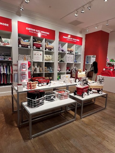
We attended the grand opening of Radio Flyer’s first ever brick and mortar store in late 2023. The 107 year old, Chicago-based and family-owned company has created a store that lives up to its legacy.
Visitors to the store located at Woodfield Mall in Schaumburg, Illinois will find the complete Radio Flyer catalog, plus a bit of the unexpected. The store has a Flyer bike shop, a service center, and test tracks so shoppers can try before they buy. The store is well-signed and most items are placed within reach. The display above makes effective use of the fixture, filling the top spaces with gift ideas and informational signing. The speed bump features flexible stacking tables that can be configured to whatever is displayed there. The décor pops in stark white and bright red, the brand’s signature colors.
How you display products on your sales floor is just as important as your assortment. And sometimes even more so. If you want to move shoppers toward your displays focus on curation of product, technique and signage; a combination that is sure to capture the attention of impulsive buyers. Do that and you’re golden!

