Color Psychology: What Color Should You Paint Your Sales Floor?
Is it time to shake things up on your sales floor? Maybe that shake-up includes refreshing your store décor? Color plays a significant role in how customers perceive your store, so before you run to the paint store, you’ve got to understand how color will affect shoppers on your sales floor.
Customers make value judgments about your store within the first ten seconds of contact – it isn’t fair, but we all do it. You’ve spent hours in your favorite store because you felt comfortable being there, and you’ve also walked into stores and walked back out just as quickly because you don’t. Each store’s décor had something to do with how long you stayed.
There are two uses of color in store décor: Primary Colors (neutrals) and Secondary Colors (bold accent colors). The primary color should be 80 percent of your store’s décor; its job is to create a relaxed atmosphere for customers to shop. Your accent color(s) take up the remaining 20 percent of your décor. You can go with a Monochromatic Color Scheme – the use of a single color in varying shades or a Complimentary Color Scheme – creating a color contrast by selecting colors directly opposite each other on the color wheel.
Whenever we give a presentation on store design, we always ask everyone to take a look around the meeting room. Convention centers and hotels collaborate with interior designers to select décor colors that ensure attendees stay and return. We’ve yet to find a meeting room that doesn’t follow the 80/20 décor rule.
Color Psychology
After a presentation on store design, a retailer sheepishly approached us and asked if we’d look at photos of his newly remodeled store – his newly remodeled BRIGHT RED store. The floors were shiny red, the fixtures were red, the walls were red, the checkout counters were red – you get the picture. Red is a great accent color because it stimulates shoppers to make quick decisions, but as a primary color it’s a bust. Too much red can be agitating, so we asked the retailer to place an associate at the front of his store for two weeks to clock how long customers stayed in the store. Just as we suspected, customers didn’t stay any longer than they had to, if they stayed at all. To get sales back on track, the retailer had to redo his entire store. That’s the power color has on your business.
Red is the color most used in packaging because of its “LOOK AT ME!” qualities – red grabs attention. Look closely at grocery aisles and you’ll notice that over 80 percent of the items have red on their labels. On the sales floor, red is most often used to announce a sale or a sharp price.
Red is an aggressive color that many people cannot tolerate in large doses. Exposure to the color red actually speeds up our metabolism. It has been proven to raise blood pressure and increase respiration rates. Too much red can make people anxious, even angry. And like our retailer friend found out, too much red can drive customers away.
Pink is a happy, romantic, light-hearted color. There’s a reason Pepto-Bismol is pink; like the color itself, it’s soothing. Sports teams have been known to paint guest locker rooms pink to drain the opposing team’s energy.
Orange just makes people happy. It’s the color of energy and enthusiasm, and it has a positive effect on people. Orange is a motivating attention-getter that just makes you feel good.
Yellow is an optimistic color. It’s warm and cheery. Have you ever wondered why legal pads are yellow? The color is supposed to help with concentration. We see yellow before we see any other colors. It’s especially effective when used with black, that’s why “Caution” and other important signs use this color combination. But too much yellow can be hard on the eyes, causing fatigue or agitation – not good for creative types. And there are plenty of studies that show babies cry more in yellow rooms.
Green is calming and refreshing, the color of nature. A popular color in home décor, studies have shown that green is relaxing and the easiest color on the eye. But be careful of using too much dark green in your store décor; it’s too easily equated with money. You want customers to shop in peace, not be concerned with the money they are about to spend.
Brown signifies warmth and security. It’s a stable, dependable, down-to-earth color. Various shades of brown in leather and wood have always been popular choices for store fixtures.
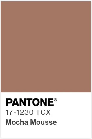
PANTONE 17-1230 Mocha Mousse, a warming, brown hue imbued with richness, is the Pantone Color Institute’s color of the year for 2025.
Blue is the poster child color of interview attire because it represents trust and loyalty and confidence. The 80/20 rule works with clothing, too; turn on the TV and you’ll see politicians and anchormen wearing dark blue suits with bright ties.
Blue is used in office settings because studies show people are more productive when surrounded by it. It’s also said to lower your pulse rate. Blue is commonly used in airplane décor because of its calming qualities, and hospitals rely on light blue to help with healing and to invoke feelings of tranquility.
Purple is a rare color that doesn’t happen too often in nature. Perhaps that’s why it’s widely considered the color of royalty. Purple is typically used to symbolize luxury, wealth and sophistication.
White is clean and bright; it’s used to portray light and purity. White has been referred to as the absence of color and the color of perfection. While it’s a good primary color, it’s hard to take when used all by itself. We remember a designer shoe store in Las Vegas that was done entirely in white. From the outside the store glowed, and the merchandise really stood out. Inside, the décor was too stark and too bright. It took a few moments for your eyes to adjust, not exactly a good thing when the goal is to make customers spend quality time in the store.
Black is at the other end of the spectrum. It’s been described as the presence of all colors and it’s an attention grabber. Black fixtures really make merchandise pop. As a wall color it can make a space seem smaller, the same way a black suit can make you look slimmer. Black is a good color to paint a high ceiling. By making the ceiling almost disappear, the space becomes more intimate.
What to do next
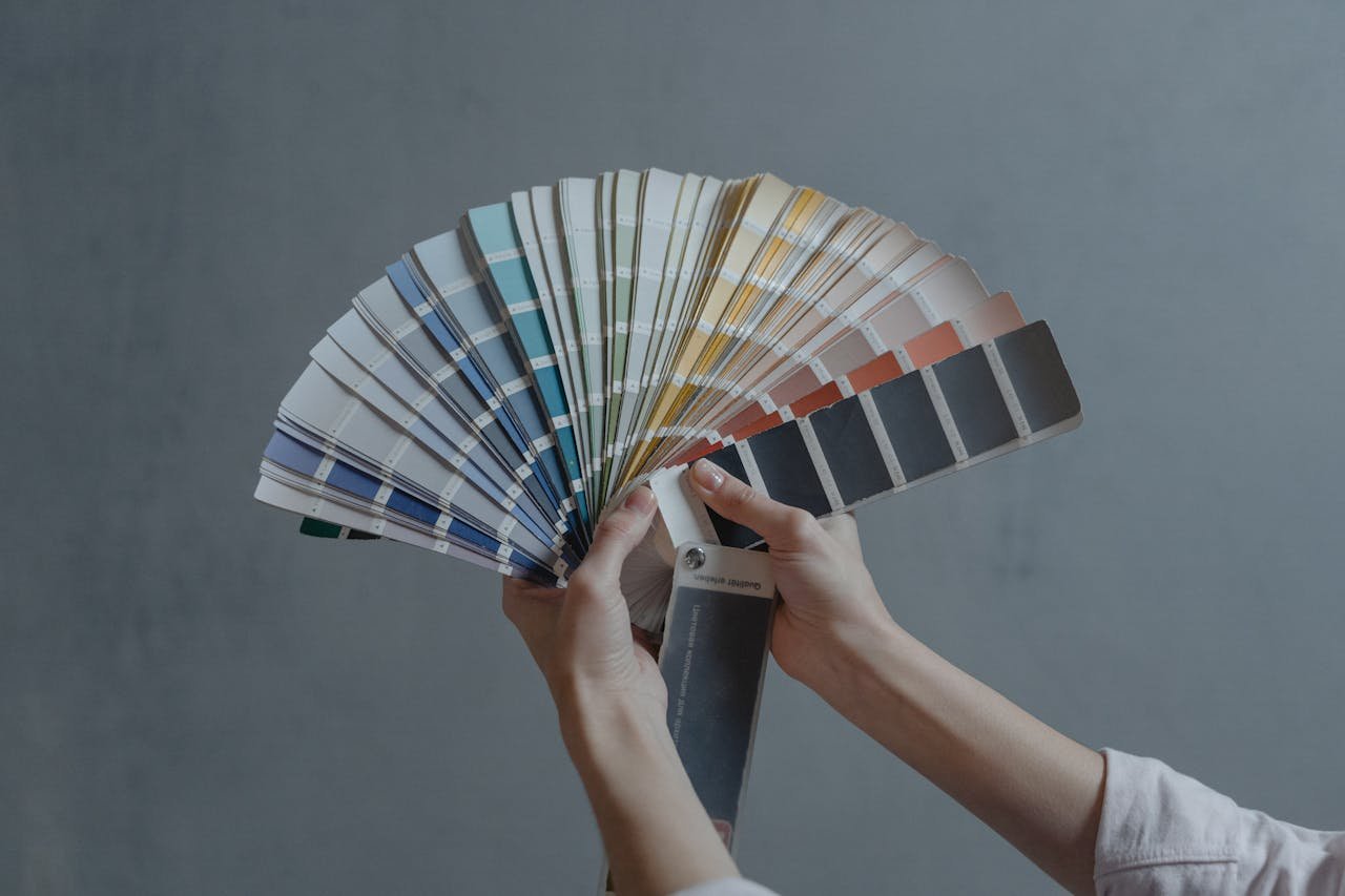
Decisions, decisions! You can get started by spending an hour or two at the library looking through interior design books and magazines. You can peruse the upscale shops in town to get a feel for how store decor works; rest assured, they have paid someone big bucks to choose their colors. Model homes and five-star hotels are a good bet as well. You can hire a store planner or an interior decorator, or you can just do it yourself. What’s the worst that can happen? You paint the wall another color. Sure, that takes time, but not a whole lot of money. Paint and hardware stores offer free design help and free color charts. And if you aren’t into commitment, many paint companies sell tiny sample jars and stickers so you can test drive the color first. And you'll find a bottomless pit of ideas on Pinterest.
At the end of the day, your store décor must do two things: make shoppers feel comfortable in the store, and most importantly, let the merchandise shine. Choose a color scheme that suits your merchandise, your space, and your brand identity. And as always, if you’re not sure what to do first, give us a call or drop us an email. We’re always good for an idea or two!


